

Beginner's Guide On Building A Responsive Web Using HTML & CSS
Building web design with best practice


What Is A Responsive Design?
Have you tried creating a web design, especially for a potential client? Here is how to get down to achieving a responsive web design by using a two-dimensional layout, and grid system for your web.
A responsive web design is a way in which a web browser loads layouts developed specifically for that given device.
Why Use A Responsive Web Browser
It provides users with an easy experience between the mobile and desktop versions of their websites. It provides users with faster pages, improved SEO, lower bounce rates, higher conversion rates, lower maintenance needs, faster mobile development at reduced cost and easy analytic reporting
Easy HTML Tags And CSS Properties For Building Web Design
There are many HTML and CSS tags and properties for structuring your web. Some of these tags are used to demonstrate actions you would use to specify on your web browser.
HTML Tags
<HTML>, <!DOCTYPE>, <head>,<title>, <body>, <span>, <br>, <b>, <li>, <ol>, <strong>, <em>, <h1>.....<h6>, <img src="">, <link rel="">,<hr>, <ul>, <a href=..> , <label>, <section>, <input type=..>, <div>, <button>, <cite>, <del>, <dt>,<td>, <tr>, <tbody>, <tfoot>,<table>, <thead>, <article>, <blockquote>, <footer>, <i>, <nav>, <th>, <caption>...
CSS Properties
color, display, background, background-color, width, height, border, padding, transform, align-item, justify-content, inline, font, font-weight, margin, margin-left, margin-right, list-style, line-height, letter-spacing, column, column-rule, align-self, align-content, border, border-radius, animation, position, box-sizing, text-decoration, text-indent, text-shadow, outline, resize, top,vertical-align, max-width, max-height, min-width, min-height.....
Steps For Building A Responsive Web Design
With using a few lines of code, you can achieve building a responsive design. In this article, we will dive into how you can build a simple web design using the grid layout. For a start, you want to get ready the IDE, Visual Studio Code or Sublime Text for your work to write your code.
To enable the HTML structure on your VS code, use the command on your keyboard shift+1, enter while making sure a folder for your project is created in your local machine and your HTML document, a file name ' index.html and style.css' is separately created in your directory. This keeps your code organized and your overall project in order.
The <div> tag is an important tag that defines a section when using the HTML document. The <div> tag also makes styling easy with the help of the class and Id attribute enabling styling in the CSS document.
Once on your code, the div tag is used to section each grid layout as shown in Fig 1. CSS styling becomes easy when the div tag is well structured using the class attribute, <div class="grid-container ">... The class attribute is indicated with a dot in the CSS document. That way, a selector is defined in the CSS document to enable styling and with the help of the CSS properties, your code becomes easy to execute.
One of the CSS elements that enable a responsive web design is the media query. The media query element is used for styling different media devices and to check the height and width of the viewport of a device. This helps users gain experience between mobile and desktop versions of their websites where the min-width for a mobile device is 320px and max-width is 480px and for the desktop versions a min-width of 640px and max-width of 1024px. For this article, we only discussed the @media screen size with min-width for desktops and smaller devices, and tablets. fig. 2b.
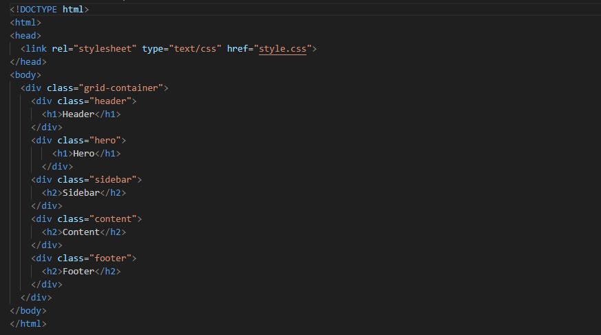
Fig: 1
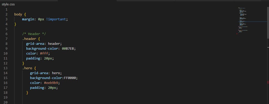
Fig: 2
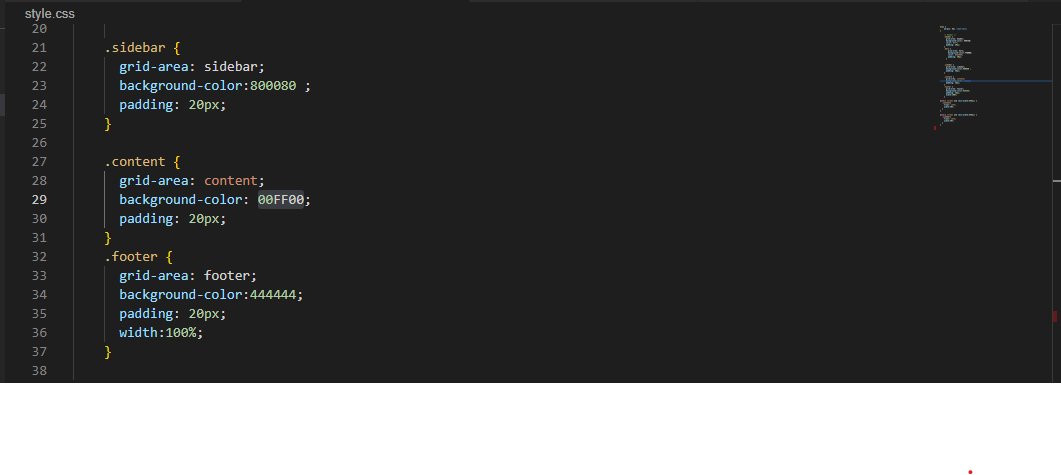
Fig: 2a
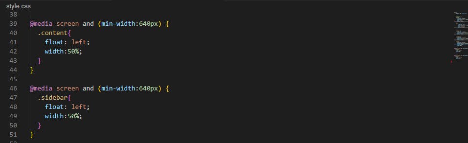
Fig: 2b
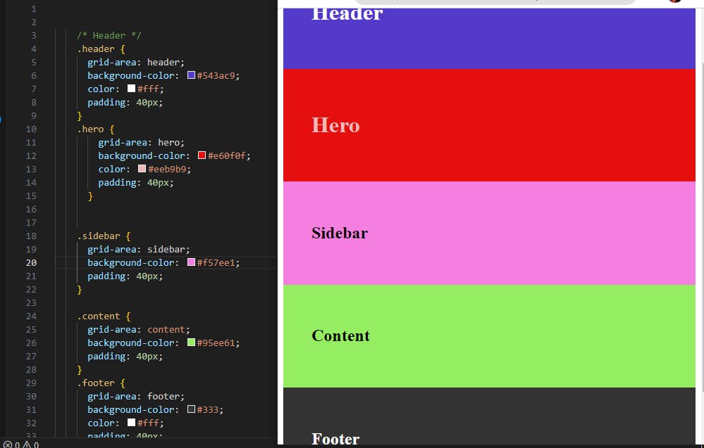
Fig: 3
Conclusion
In this article, I have been able to guide us through the basics of building a responsive web design and its many benefits. I have also been able to pass on the basic knowledge in this article on the different HTML tags and CSS properties. We also learned how to get started with your Code editor and how you can start coding and finally create a responsive web design.